I created this blog to illustrate some of my learning efforts in R programming. Studying R, I found it much easier to practice the language by applying it to real-world datasets instead of textbook examples. The first dataset I use for some experimentation is the OECD Triadic Patent Families Database. This dataset provides endless possibilities for quantitative analyses in the realm of innovation studies and intellectual property statistics.
What is the OECD Triadic Patent Families Database?
The TPF database combines patent data from the most important patent offices in the world: the European Patent Office (EPO), the Japanese Patent Office (JPO), and the US Patent and Trademark Office (USPTO). Triadic patent families (the observations in the dataset) are patents that were registered in all three of these offices. It is common for companies or other innovating entities to register valuable innovations in multiple patent offices, to protect their intellectual property internationally. Furthermore, it can be assumed that most patents in the TPF database hold some economic value, because the applicants willingly went through the organizational trouble to register them with all three major patent offices. This results in a preselection of valuable patents, which is advantageous for innovation studies. The TPF database is freely available to researchers and regularly updated by the OECD. Anyone can apply for access here. The dataset is supplied in multiple csv-files and contains among others data on the date of patent applications, the name of the applying entity/entities, name of the inventor(s), country of the applicants and inventors, and technological category of the invention in the format of the International Patent Classification (IPC).
Why analyze patent data?
The above list of information in the dataset should already hint at some worthwhile applications. Patent analysis can reveal insights concerning the innovative activities of companies and countries, the progression of innovation over time, and newly emerging technological fields, to mention just some possibilities. Quantitative patent analyzes belong to the basic repertoire of academic as well as business-level innovation studies. Whereas academia seeks to expose and explain patterns of innovation, businesses may be interested in technology forecasting and investigating the innovative activities of competitors.
A first look at the data.
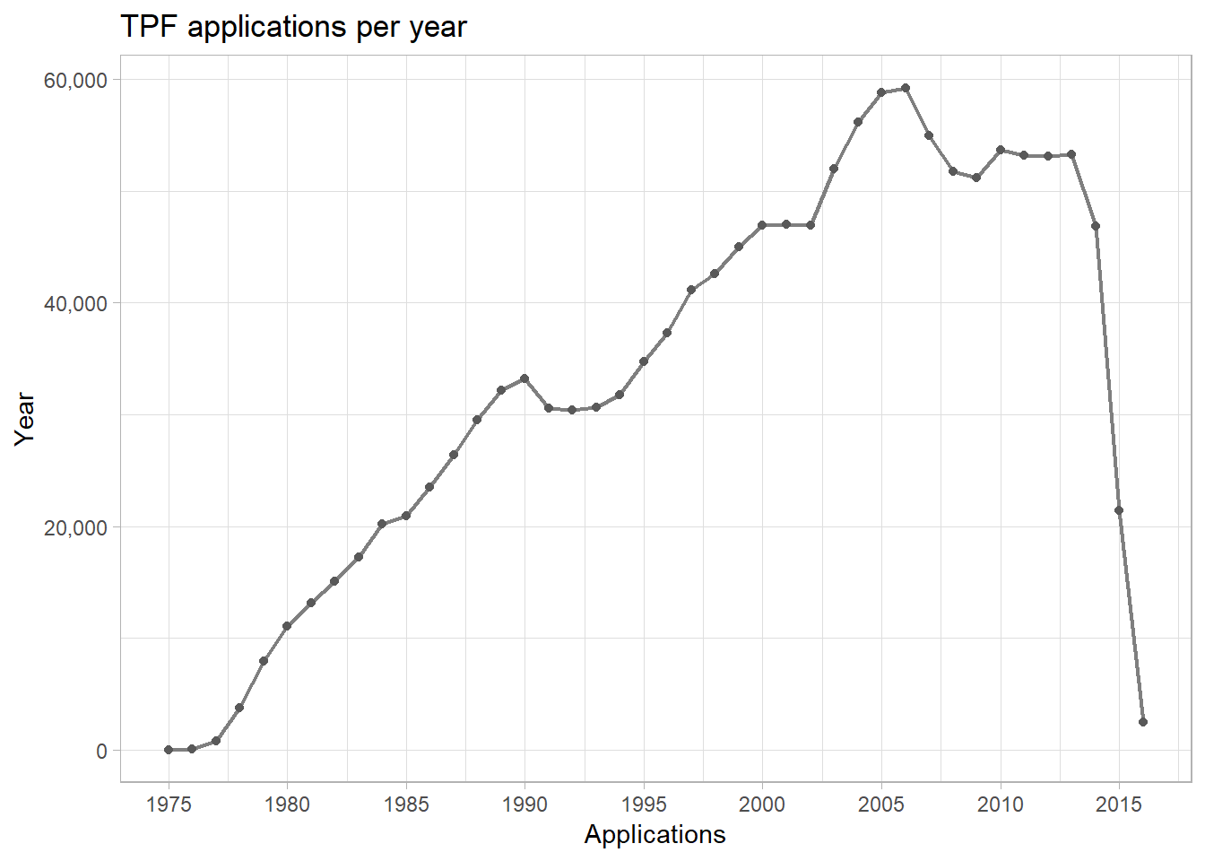
The March 2018 version of the dataset comprises data on 1,427,665 TPFs. The graph below illustrates TPF entries per year. As the dataset contains multiple dates per TPF (e.g. date of application for each patent office and date of grant), a decision had to be made how the year of a TPF is determined. The year-variable was set to contain the year of the earliest application.
The graph was produced using ggplot2 and the following code.
#linegraph of TPF applications per year
library(ggplot2)
library(ggthemes)
ggplot(annual_totals[annual_totals$year %in% 1975:2016, ], aes(year, applications)) +
  geom_line(size = 0.8, color = "grey50") + geom_point(shape = 16, color = "grey35") +
  labs(title = "TPF applications per year", x = "Applications", y = "Year") +
  scale_y_continuous(labels = function(x) format(x, big.mark = ",", scientific = FALSE)) +
  scale_x_continuous(breaks = seq(1975, 2015, 5)) +
  theme_light()
Overall, TPF applications over time exhibit a steep increase from the late 70s until the peak of about 60,000 applications in 2006. The following slump may be explained by the global financial crisis of 2007/2008, which put pressure on research budgets. Application counts fall dramatically from 2013 onward. This is explained by the time it takes for patent applications to be registered in the TPF database (applications only become TPFs once they have been filed with the three major patent offices). Additionally, the date of the earliest application was used here to determine the year.
Country-specific applications over time
Country data in the database allows for international comparisons. However, determining the country of origin of a TPF is not entirely straightforward. Firstly, the data includes information on the country of the applicant (usually companies, but also universities or other public research institutes) and the country of residence of the inventor. Secondly, most TPFs list multiple applicants and inventors, who may come from different countries.
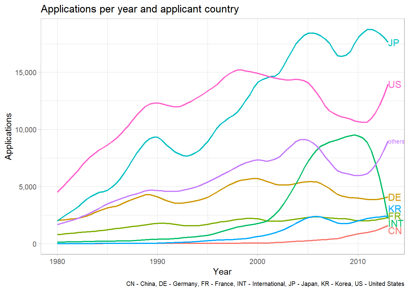
The graph below illustrates TPF applications per applicant country. Patents with applicants from more than one country where categorized as ‘international’. Additionally, only the largest applicant countries are represented in this graph. I subsumed countries with few applications in the ‘others’ category. The line graph uses ggplot’s stat_smooth() to create a visually more appealing plot.
library(directlabels)
ggappcountries <- ggplot(ann_counts_big[ann_counts_big$year %in% 1980:2013, ],
                      aes(year, count_app, color = country)) +
  stat_smooth(method = "loess", size = 0.8, se = FALSE, span = 0.2) +
  labs(title = "Applications per year and applicant country",
       caption = "CN - China, DE - Germany, FR - France, INT - International, JP - Japan, KR - Korea, US - United States",
       x = "Year", y = "Applications") +
  scale_y_continuous(labels = function(x) format(x, big.mark = ",", scientific = FALSE)) +
  theme_light() + theme(plot.caption = element_text(size = 7.5))
direct.label(ggappcountries, "last.qp")
Countries to be subsumed in the ‘others’ category were selected by considering application counts in the year 2013. This resulted in Japan, the US, Germany, Korea, France, China, and the international category being the strongest applicants. South Korea and China are up-and-coming candidates, while the dominance of Japan and the US appears to be undisputed. International applications experienced a steep rise in the 2000s and an equally steep fall thereafter. Possibly international applications take longer to become registered as TPFs than single-country applications?
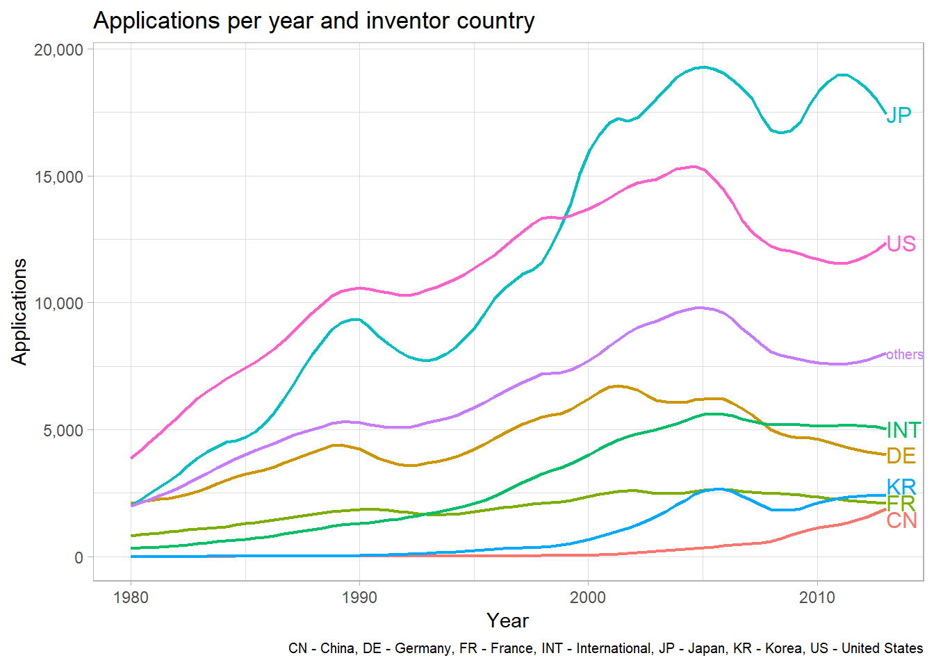
Using almost the same code as above, the graph for TPF applications per inventor country can be created. The result is very similar except for international applications. Apparently the growth in international inventor teams was not as large as the growth in international applicant cooperation. One may hypothesize that multinational corporations from the most innovative countries still tend to primarily employ researchers from their home-country.
