Country dispersion in patent applications
The TPF database contains data on the country of origin of patent application (country of residence of the inventor(s) and country of the applying organizations). This allows for interesting investigations into country-specific aspects of innovative activity. In this post I will investigate the issue of country dispersion in patent data. Country dispersion is a measure of the degree of internationality of patent applications. According to Lee (2016), the country dispersion index is calculated as \[D = 1 - \sum_{i=1}^N S^2_{i}\] where \(N\) is the number of countries involved in a patent and \(S_i\) is the share of inventors located in country \(i\). The country dispersion index yields a value between \(0\) (all inventors from one country) and \(1\) (inventors dispersed across an infinite number of countries).
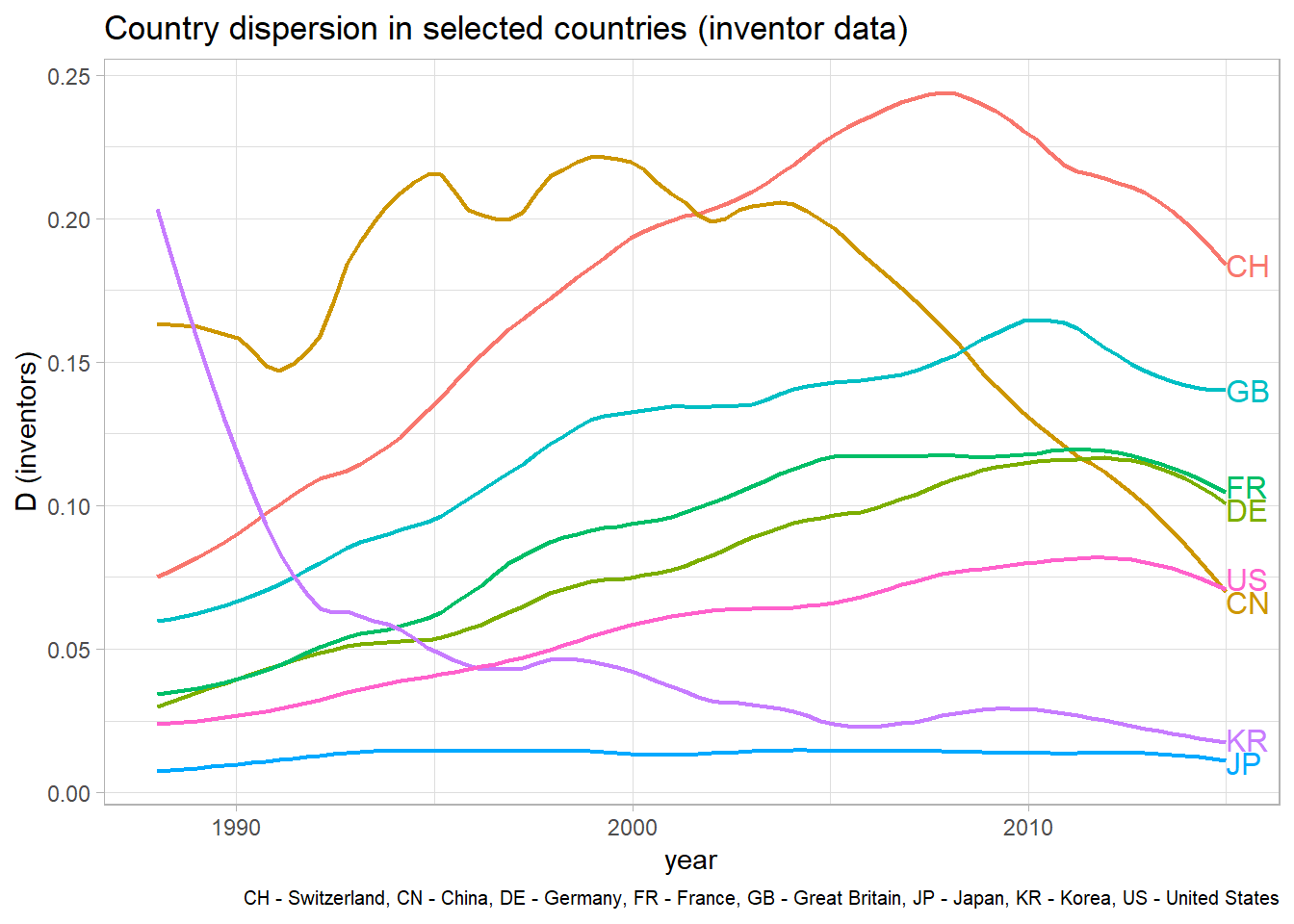
The result of a simple graphical analysis of country dispersion over time in selected countries (and the code to produce the plot) is depicted below. Country dispersion indexes were calculated by applying the above formula to each TPF in the database; annual country averages were then obtained by averaging the dispersion values per year and country. TPF were considered to ‘belong’ to a country, if at least one of the registered inventors (or applicant organizations) was from the respective country.
disp_inv_graph <- ggplot(data = disp_inv_sub[disp_inv_sub$year %in% 1988:2015, ],
                         aes(year, dispersion, color = country))+
  stat_smooth(method = "loess", size = 0.8, se = FALSE, span = 0.3) +
  ylab("D (inventors)") +
  labs(title = "Country dispersion in selected countries (inventor data)",
       caption = "CH - Switzerland, CN - China, DE - Germany, FR - France, GB - Great Britain, JP - Japan, KR - Korea, US - United States") +
  theme_light() +
  theme(plot.caption = element_text(size = 7.5))

direct.label(disp_inv_graph, "last.qp")
The graph clearly reveals the isolated nature of Japan’s innovation system. Japan has by far the lowest country dispersion values among major innovative economies and there was no notable increase since the 1990s. Germany, France, Great Britain, Switzerland, and the US are on a positive trajectory, as would be expected considering the increasing ease of international communication, travel, and data exchange. The downtrend in these countries in recent years may be an artifact in the data, resulting from incomplete records in the newest data. The large difference between the US and Switzerland’s country dispersion index may in part be explained by the size of domestic knowledge bases. A large domestic knowledge base necessitates less input from foreign inventors. This consideration can also explain the development of country dispersion in China and South Korea. These catch-up economies experienced rapidly declining internationality in inventor networks during the proliferation of their domestic knowledge pools. Korea even approaches the absolute lows of the Japanese case, despite being a smaller economy.
Applicant Data
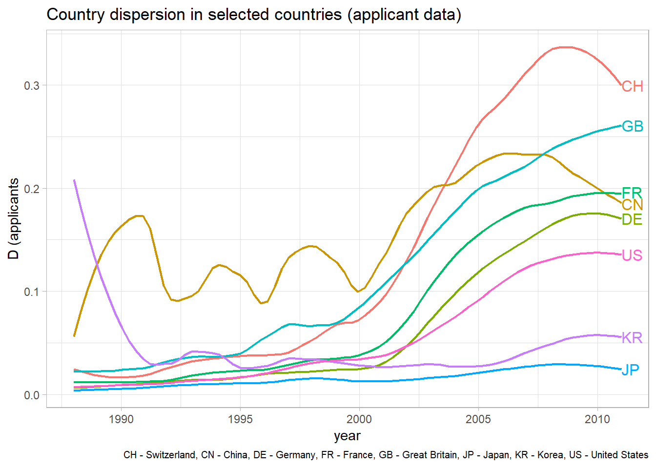
The same analysis can be performed using applicant instead of inventor data. In the majority of cases the applicants are companies that want to protect their intellectual property. The below graph reveals that applicant dispersion increased more markedly over time than inventor dispersion. This holds true for all countries considered here. Thus, we can conclude that international innovation networks proliferated on the company/organization-level rather than between individual inventors. The ordering of countries in terms of their internationality remained roughly the same. The code to produce the following graph is almost identical to the one above, and was therefore not included again.

Dispersion Over Time
The graphs above invite the assumption that country dispersion in general increases in the time period under investigation. To take a closer look at this claim, the overall country dispersion averages of all countries in the dataset can be plotted over time. The code chunk below creates a dataframe for dispersion averages, calculates them for inventor and applicant data, and plots the data.
#initialize data.frame for annual averages (over all countries) annual country dispersion
disp_avg <- data.frame(year = 1988:2016, inv = NA, app = NA)

disp_avg$inv <- sapply(disp_avg$year, function(x) {mean(disp_inv$dispersion[disp_inv$year == x], na.rm = TRUE)})
disp_avg$app <- sapply(disp_avg$year, function(x) {mean(disp_app$dispersion[disp_app$year == x], na.rm = TRUE)})

library(tidyr)
disp_avg_long <- gather(disp_avg, var, D, inv, app) #transform into long data

ggplot(data = disp_avg_long, aes(year, D, color = var)) +
  geom_smooth(method = "loess", size = 1, span = 0.4, se = FALSE) +
  ggtitle("Average annual country dispersion") +
  scale_color_hue(labels=c("applicant dispersion", "inventor dispersion")) +
  theme_light() +
  theme(axis.title.y = element_blank())
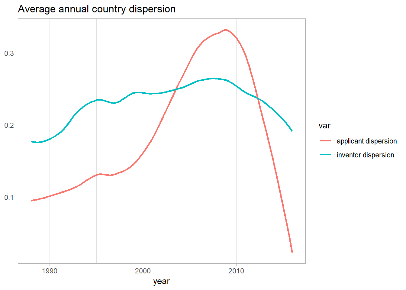
In general, the graph supports the conclusion that country dispersion increases over time. Incomplete records for the most recent years seem to be the most intuitive explanation for the marked decrease of dispersion since 2009, but this cannot be determined with certainty here. Plotting the curves in one graph reveals the considerable difference between inventor and applicant dispersion, with applicant dispersion exhibiting a much more drastic increase.
References
Lee, Ahreum, Ram Mudambi, and Marcelo Cano-Kollmann. 2016. “An Analysis of Japan’s Connectivity to the Global Innovation System.” Multinational Business Review 24 (4). Emerald Group Publishing Limited: 399–423.